
Introduction:
In the ever-evolving landscape of web development, staying abreast of the latest technologies is crucial. One such innovation that has revolutionized the way we approach web layouts is CSS Grid. This powerful layout system provides developers with a flexible and efficient way to create complex web designs. In this article, we’ll delve into the role of CSS Grid in modern web layouts, exploring its features, benefits, and practical applications.
Understanding CSS Grid:
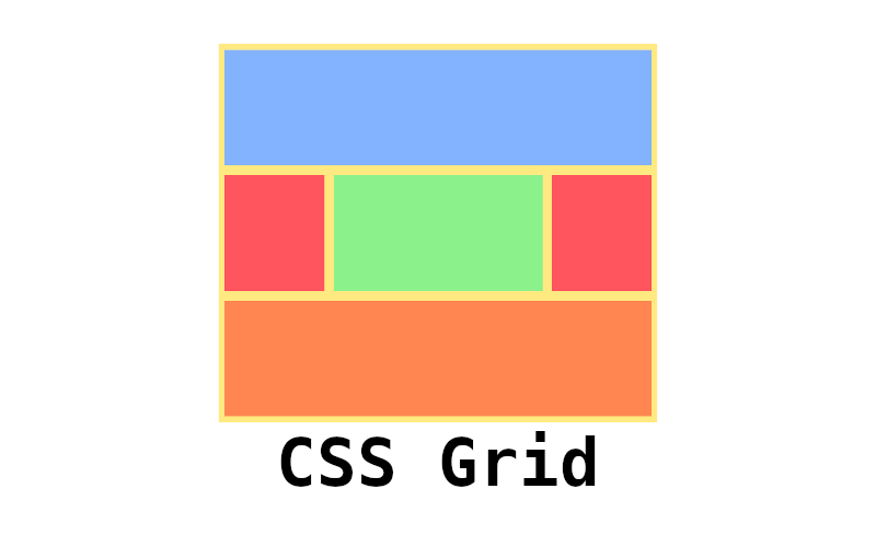
CSS Grid is a two-dimensional layout system that allows developers to create grid-based layouts with rows and columns. Unlike its predecessor, Flexbox, which is designed for one-dimensional layouts, CSS Grid excels at handling both rows and columns simultaneously. This makes it particularly well-suited for creating complex, responsive designs.
Key Features of CSS Grid:
- Grid Container and Items:
CSS Grid introduces the concept of a grid container, which holds all the grid items. Developers can define the grid using thegrid-template-rowsandgrid-template-columnsproperties. This level of control provides the flexibility needed for intricate layouts. - Responsive Design:
CSS Grid simplifies the process of creating responsive designs. By using media queries, developers can easily adjust the layout based on the screen size, ensuring a seamless experience across various devices. - Alignment and Spacing:
Aligning items within the grid is effortless with CSS Grid. Thejustify-contentandalign-itemsproperties enable precise control over the positioning of content. Additionally, thegrid-gapproperty streamlines the management of spacing between grid items. - Grid Lines and Areas:
CSS Grid introduces the concept of grid lines, which define the boundaries of rows and columns. Developers can create named grid areas, allowing for a more intuitive approach to layout design.
Benefits of Using CSS Grid:
- Simplified Code:
CSS Grid simplifies the code required for complex layouts. With fewer div elements and a more straightforward structure, developers can achieve sophisticated designs with cleaner, more maintainable code. - Improved Readability:
The intuitive nature of CSS Grid enhances code readability. The grid-template properties provide a clear overview of the layout structure, making it easier for developers to understand and collaborate on projects. - Enhanced Flexibility:
One of the key strengths of CSS Grid is its flexibility. Developers can easily create asymmetrical layouts, rearrange content dynamically, and experiment with different design possibilities without compromising responsiveness. - Efficient Positioning:
The ability to precisely position items within the grid reduces the need for additional CSS rules. This efficiency streamlines the development process and promotes a more modular and scalable codebase.
Practical Applications:
- Complex Web Layouts:
CSS Grid is ideal for designing intricate web layouts, such as those found in e-commerce websites, dashboards, or multimedia-rich pages. Its two-dimensional structure facilitates the organization of diverse content. - Responsive Landing Pages:
Creating responsive landing pages becomes more accessible with CSS Grid. Designers can craft visually appealing and functional landing pages that adapt seamlessly to various screen sizes. - Magazine-style Websites:
Magazine layouts, with their grid-based structures, benefit significantly from CSS Grid. The system’s flexibility allows for creative arrangements of articles, images, and advertisements.
Conclusion:
CSS Grid has emerged as a game-changer in the realm of web development, offering a powerful and flexible solution for modern layouts. Its ability to simplify code, enhance readability, and provide efficient positioning makes it a valuable tool for developers striving to create visually compelling and responsive websites. As the web continues to evolve, mastering CSS Grid is becoming increasingly essential for staying at the forefront of design and development.