Introduction:
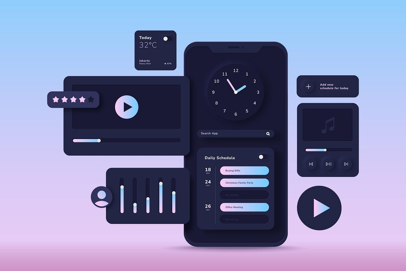
In recent years, dark mode design has become increasingly popular across various digital platforms, ranging from mobile applications to desktop software. This aesthetic choice not only adds a sleek and modern look to interfaces but also offers tangible benefits to users. In this article, we explore the advantages of dark mode design, focusing on how it enhances user experience and reduces eye strain.
Advantages of Dark Mode Design:
- Reduced Eye Strain:
Dark mode significantly reduces eye strain, especially during prolonged usage. Traditional light interfaces emit high levels of blue light, which can contribute to eye fatigue and discomfort. Dark mode, with its darker background and lower brightness, minimizes the impact of blue light, making it easier on the eyes. - Enhanced Visibility in Low-Light Conditions:
One of the key benefits of dark mode is improved visibility in low-light environments. The contrast between text and background is more pronounced in dark mode, allowing users to read content without causing discomfort to their eyes. This is particularly advantageous in situations where users may be in a dimly lit room or using their devices at night. - Extended Battery Life (for OLED Screens):
Devices with OLED screens can experience improved battery life when using dark mode. Unlike traditional LCD screens that use a backlight for illumination, OLED screens emit light on a per-pixel basis. In dark mode, fewer pixels are lit, resulting in less power consumption and potentially extending battery life. - Aesthetic Appeal and Modern Design:
Dark mode is often associated with a sleek and modern design aesthetic. Many users appreciate the stylish and contemporary look that dark mode brings to applications and websites. Implementing dark mode can also cater to users who prefer a more visually appealing interface.
Implementing Dark Mode Effectively:
- User Preference Settings:
To ensure a positive user experience, it’s crucial to provide users with the option to choose between light and dark modes. Allowing customization based on user preference ensures inclusivity and addresses the diverse needs and preferences of the user base. - Consistent Color Schemes:
When implementing dark mode, it’s essential to maintain a consistent color scheme to ensure readability and visual harmony. Careful consideration of text and background colors is necessary to avoid compromising accessibility. - Accessibility Considerations:
While dark mode offers benefits, it’s important to consider accessibility. Some users may have visual impairments or conditions that make reading dark text on a dark background challenging. Providing accessibility options, such as adjustable contrast or font size, ensures inclusivity.
Conclusion:
Dark mode design has evolved beyond a mere aesthetic preference; it is now recognized as a practical solution for improving user experience and reducing eye strain. By carefully implementing dark mode with user preferences and accessibility in mind, designers can create interfaces that are not only visually appealing but also considerate of the diverse needs of their audience. As the digital landscape continues to embrace dark mode, its positive impact on usability and user comfort is expected to remain a key consideration in future design trends.


